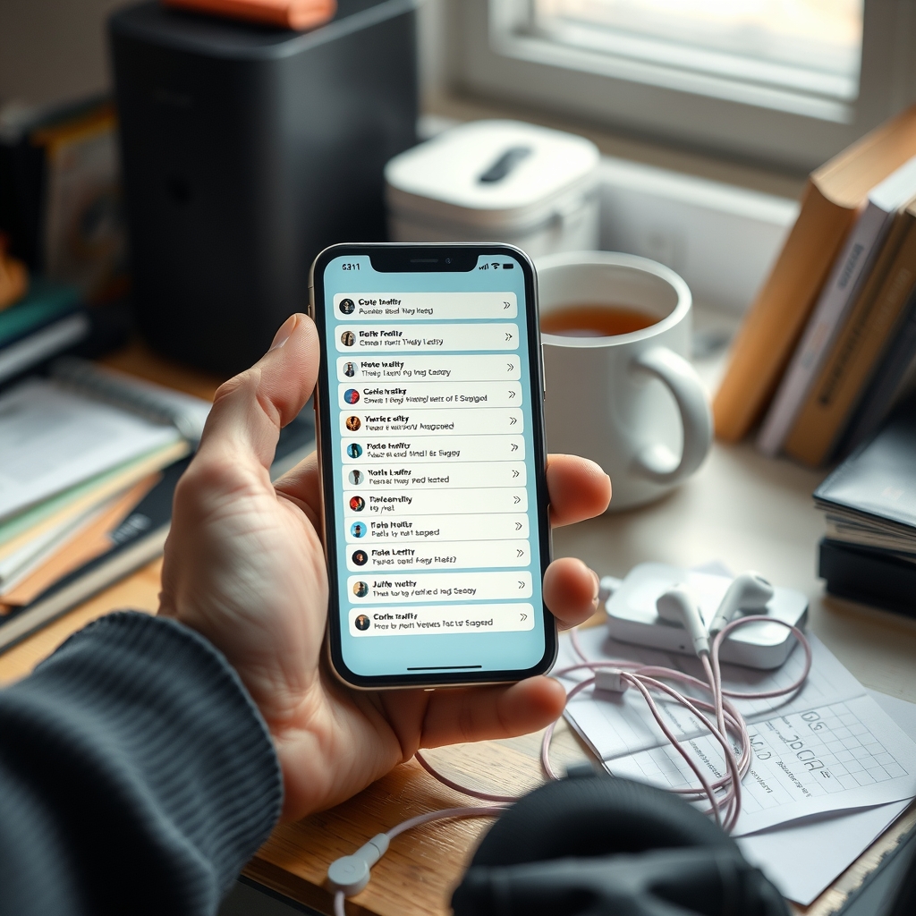
Tech Company’s ‘Human-Centered Design’ Process Completed Without Single Human, Confirms Windowless Room
Following a celebrated interface overhaul “built around real user journeys,” Lumenary Systems confirmed that its human-centered design process involved a whiteboard, a shared spreadsheet, and no humans at any stage.
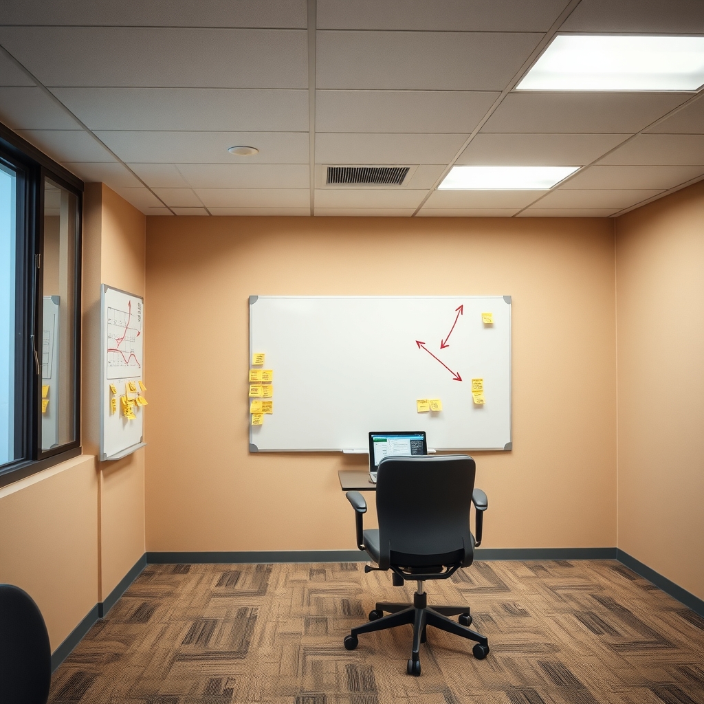
SAN JOSE — Lumenary Systems confirmed Tuesday that the widely praised redesign of its Pulse productivity app, which the company’s press release described as “built around real user journeys,” was completed entirely by the product team in a conference room with no windows, no users, and, for one stretch in March, no working lights.
The overhaul, which moves the app’s most-used feature behind three nested menus and a hamburger icon that is not a hamburger, was developed over 14 months through what the company calls its Human-Centered Design Framework. According to internal documents, the framework has five phases: Empathize, Define, Ideate, Prototype, and Approve. Humans were not consulted during any of them.
“Empathy is a mindset, not a headcount,” said Dara Venkatesan-Holt, Lumenary’s Senior Principal Director of Anticipatory Human Insight Synthesis. “We found that actual people introduce noise. They say they want one thing, then do another. Our approach was to imagine a user who does exactly what we need, and then to be very kind to him.”
That user, a composite named Kevin, appears on 212 slides. Kevin is 34, enjoys “seamless moments,” and has never once looked for the Settings button. According to team members, Kevin was developed through an exhaustive research method known as “thinking about it.”
The “real user journeys” referenced in the press release were drawn on a whiteboard in a room the team called The Cocoon. Each journey begins with Kevin opening the app and ends with Kevin experiencing delight. No journey includes a step in which Kevin is on a train, holding a coffee, or attempting to cancel his subscription.
Asked whether any real person had ever seen the redesign before launch, Venkatesan-Holt said a janitor had walked in during a late-night session in April. “We were between slides, so we couldn’t get his feedback,” she said. “He seemed to be squinting at something, though, which we logged as engagement.”
“Empathy is a mindset, not a headcount.”
Lumenary said its commitment to users remains unwavering and pointed to a feedback portal on its website. The portal, which is located under Help, then Support, then Contact, then Other, routes all submissions to a folder labeled Kevin.
Independent experts said the process was consistent with industry norms. “Most companies at least put a stranger in front of the product for a few minutes and watch them cry,” said Dr. Osric Plimsoll-Wade, a research fellow at the Institute for Retrospective Usability at a university that does not exist. “Lumenary skipped this step to preserve the team’s vision. It is a bold choice, like removing the steering wheel from a car to honor the driver’s autonomy.”
Early reviews of the new Pulse have been mixed. Users on social media described the app as “impossible,” “a hostage situation,” and “fine, I guess, once you find the thing.” Lumenary’s internal dashboard, which tracks only the sentiments of Kevin, shows a satisfaction rating of 98 percent.
The company has announced that a second phase of the redesign is underway. Product leaders say it will be informed by direct user input, provided the users can be accommodated in The Cocoon, which seats nine and cannot be reached by stairs.
This article was generated by a large language model. It is satire. None of it happened.